Problem

Customers couldn’t use the Spend Overview Dashboard on their phones.

Summary

Synopsis: I designed a solution that addressed the gap in the Spend Overview Dashboard ecosystem

In the spring of 2025, I led a project to create a mobile Spend Overview Dashboard with the help of two web developers. This project aimed to fill a gap in the product, which prioritized the desktop experience.

I conducted research and discovery to understand the product and the problems users faced. I designed concepts and iterated based on feedback, and worked closely with my developers to bring these designs to life.

The dashboard now gives customers access to their spending insights from any device. It is a flexible solution that meets customers wherever they are and shows the business's commitment to their success.

A smartphone displays a "Spend Overview" dashboard with data charts, including figures for total spend, invoices, items ordered, units shipped, fill rate, and buying locations, with a bar chart comparing top divisions like Northwest and Carolinas.

Solution: The adapted version of the Spend Overview Dashboard lets customers gather financial insight easily from any devices

  • Clear, relevant, and accessible insights

  • Streamlined collaboration

  • Learnable and organized interface

Impact: The Spend Overview Dashboard is now a modern and mobile product for the company’s evolving customers and their needs

The redesigned mobile dashboard experience has been in production since July 2025. It has filled the gap in the product space, allowing customers to access their insights from anywhere. It stands out as a modern addition to the company's customer-facing product suite.

A smartphone displays a "Spend Overview" dashboard with data charts, including figures for total spend, invoices, items ordered, units shipped, fill rate, and buying locations, with a bar chart comparing top divisions like Northwest and Carolinas.
Mobile phone displaying a financial dashboard with a bar chart showing spending in top divisions, including Northwest, Carolinas, Midwest, Mountains, and Mid South, each with varying amounts up to 1.0M.
The image shows a smartphone screen displaying an app interface listing top items by spending, with descriptions and dollar amounts, including items like a 3-in-1 Quick Pak Kit and a Liftgate Cord, exemplifying a detailed breakdown of expenditures.
A smartphone display shows a business analytics dashboard with a colorful pie chart illustrating invoice count by order submission method, highlighting segments for CSV (25.35%) and Email (9.78%), emphasizing data visualization and mobile usability.
A smartphone screen displays analytical data in the form of a list and accompanying pie chart, featuring categories like Mobile and Web, alongside a line graph charting spending over time.
A smartphone display shows a line graph comparing invoice totals over time by order submission methods, including CSV, Email, Fax, and Mobile, with different colors representing each method and corresponding percentage breakdowns listed below.

Background: I aimed to adapt a valuable business tool to be accessible from any device

Overview

Team

UX Designer

Front-end Web Developer

Back-end Web Developer

Goal

Design a version of the customer-facing reporting dashboard optimized for mobile viewing

Company

Imperial Supplies — A B2B fleet management and maintenance supplies retailer

Timeline

Spring 2025 / 3 months

Product & User: A robust financial reporting tool for business leaders to make informed budgeting decisions

Product: Accessible and relevant insights

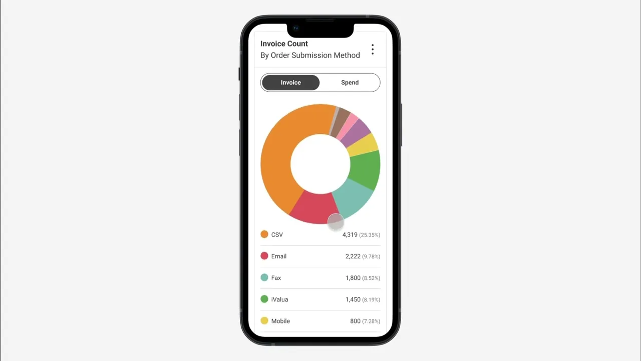
The Spend Overview Dashboard is an Imperial Supplies tool that offers customers a clear view of their spending trends. It provides insights into figures critical to financial planning, such as location spending, item-level spend analysis, payment methods, and more.

A laptop displays a "Spend Overview" dashboard with data charts, including figures for total spend, invoices, items ordered, units shipped, fill rate, and buying locations, with a bar chart comparing top divisions like Northwest and Carolinas.

Users: Leaders in fleet maintenance

Spend Overview Dashboard User

Finance managers and business owners

ImperialSupplies.com User

1/4 visiting from a mobile device

User Goal

Analyze trends to make smart planning decisions

A middle-aged man in a white shirt is standing outdoors on a balcony, smiling and focused on his smartphone, with a blurred urban skyline in the background on a sunny day.

Problem: The Spend Overview Dashboard was not usable for 25% of website visitors

On screens smaller than the average tablet, the dashboard's graphs and charts became unreadable. This gap in the design decreased the tool's value and limited customers' ability to access their information.

A smartphone displays a dashboard with details of spend overview, including total spend of 16.56M, total invoices of 41,912, total units of 454,205, and a fill rate of 99.85%, under the "Imperial" banner. The dashboard elements are misaligned and difficult to read.
A smartphone screen displays a financial dashboard with bar charts, labeled sections for "Spend: Top Divisions" and "Spend: Top Locations," showcasing budget allocation insights. The dashboard elements are misaligned and difficult to read.
The image displays a smartphone screen showcasing a webpage featuring categorized menu items on the left, such as safety, tools, and lighting, with a graph illustrating spending over time on the bottom section. The dashboard elements are misaligned and difficult to read.
A smartphone screen displaying a spend comparison chart with colorful dots and coded divisions, labeled by different colors and abbreviations, under the heading "Spend Comparison: All Locations." The dashboard elements are misaligned and difficult to read.

Project Goals: Provide clear and relevant insights on any device

My goal was to provide users with the same clear and relevant insights found on a desktop on a screen one-third the size.

Business Value: Modern mobile design that fosters improved collaboration, boosts efficiency, and enhances brand perception.

Makes it easy for clients and their account advisors to work together by providing easy access to information

Reduces the time account advisors spend finding and sending client information, streamlining workflows for both groups

Reinforce the company's culture that is dedicated to customer success and strengthen its brand perception through modern, adaptable, and customer-focused technology

Process: My process included research, discovery, design, iteration, and implementation

Research & Discovery

Sought clarity about the product and problem, and found inspiration for my solution

  • Aligned with the previous designer and developers to understand the product, business needs, and technical limits

  • Analyzed popular reporting tools to find effective design patterns

Design & Iteration

Explored concepts and iterated based on feedback and constraints

  • Sketched and wireframed in low fidelity

  • Collected feedback and brainstormed

  • Presented ideas to developers to confirm feasibility

  • Iterated, iterated, and iterated some more

Implementation

Handed the designs off, worked with developers through implementation, and conducted UAT

  • Annotated designs and outlined interaction logic

  • Worked with developers to solve issues

  • Reviewed the dashboard in UAT to ensure it met the design requirements and worked properly

Solution: My final product was a modern and mobile Spend Overview Dashboard

A smartphone displays a "Spend Overview" dashboard with data charts, including figures for total spend, invoices, items ordered, units shipped, fill rate, and buying locations, with a bar chart comparing top divisions like Northwest and Carolinas.
Mobile phone displaying a financial dashboard with a bar chart showing spending in top divisions, including Northwest, Carolinas, Midwest, Mountains, and Mid South, each with varying amounts up to 1.0M.
The image shows a smartphone screen displaying an app interface listing top items by spending, with descriptions and dollar amounts, including items like a 3-in-1 Quick Pak Kit and a Liftgate Cord, exemplifying a detailed breakdown of expenditures.
A smartphone display shows a business analytics dashboard with a colorful pie chart illustrating invoice count by order submission method, highlighting segments for CSV (25.35%) and Email (9.78%), emphasizing data visualization and mobile usability.
A smartphone screen displays analytical data in the form of a list and accompanying pie chart, featuring categories like Mobile and Web, alongside a line graph charting spending over time.
A smartphone display shows a line graph comparing invoice totals over time by order submission methods, including CSV, Email, Fax, and Mobile, with different colors representing each method and corresponding percentage breakdowns listed below.
A smartphone display shows a financial app with "Spend Trends: All Divisions" highlighting regional spending that can be filtered by varying information.

Key Decisions: Implemented drawers to maintain a clean interface with advanced functionality and to prepare for product growth

UI Enhancement: Drawers

Bottom sheets and drawers are a popular design pattern for a reason. They help maintain a simple interface while still offering advanced settings and features.

This choice also sets the mobile dashboard up to grow in tandem with the desktop version. As new functions and settings are added to the dashboard, they can be placed in the drawer, eliminating the need for extensive rework by designers or developers.

UX Recommendation: Sharing

I suggested adding a "share" button to the widget drawer. This feature would allow users to easily email files to themselves or their teammates.

This addition would allow users to access files across different devices and collaborate more seamlessly. I made this recommendation based on my understanding of the primary users' roles and responsibilities.

A gif of a smartphone displays a financial app, demonstrating the apps ability to download reports and share directly.

Key Decision: Widgets that prioritize clarity, accessibility, and reusability

My goal was to give users clear, relevant, and easy-to-understand information. I also wanted to design the tables and charts to work with various data sets without needing much rework.

My decisions were guided by the following needs:

  • Show the most relevant and impactful information

  • Present information in an easily digestible format

  • Work within the limits of our technology

  • Be visually and functionally accessible

  • Create patterns that can be used with a variety of data sets

An example of Malaika's iterative process and thinking while designing shown through a variety of tables showing spend trends with bar charts, and dropdown menus along with questions she asked herself while designing.

Outcome: The dashboard filled an immediate need and will be continuously improved

Impact: The mobile Spend Overview Dashboard addressed a gap in the product space with an accessible and modern solution

The redesigned mobile dashboard experience has been in production since July 2025. It has filled the gap in the product space and distinguishes itself by modernizing the company's customer-facing product suite.

Next Steps: Improvement driven by analytics and user feedback

  • Collect feedback from customers and account advisors

  • Review analytics to measure adoption and identify pain points

Reflection: UX-ing teamwork

Insight: Using empathy and curiosity to foster collaboration

Good teamwork requires empathy and curiosity, just like design. I approached conversations with the developers with a sense of curiosity and humility. As a new addition to the team, my goal was to gain a deeper understanding of my teammates and the business. This helped me grasp the context of our work and to advocate effectively for the best user experience. Building these relationships was essential to the success of the project.

Malaika Powell

Home

About

Connect

Imitation is the highest form of flattery, but stealing other people’s work is lame. I’m a generous with my time, so please reach out so we can talk about designing something that is true to you.

Malaika Powell

Home

About

Connect

Imitation is the highest form of flattery, but stealing other people’s work is lame. I’m a generous with my time, so please reach out so we can talk about designing something that is true to you.

Malaika Powell

Home

About

Connect

Imitation is the highest form of flattery, but stealing other people’s work is lame. I’m a generous with my time, so please reach out so we can talk about designing something that is true to you.

Malaika Powell

Home

About

Connect

Imitation is the highest form of flattery, but stealing other people’s work is lame. I’m a generous with my time, so please reach out so we can talk about designing something that is true to you.