Mobile Design for Customer Spending Dashboard
Designing a mobile-friendly dashboard, providing easy access to spending data, supporting customer decision-making, and aligning with the business's technology transformation initiative


Internship
UI Design
Responsive Web Design
Introduction
Imperial Supplies is a national distributor of maintenance and fleet management supplies. They offer customized solutions to meet their customers' needs, and their customer-managed inventory business model empowers customers and helps reduce their costs.
TLDR: Imperial Supplies sells a lot of nuts and bolts, and they're really good at it.
As the UX Designer on this project, I optimized the customer-facing Spend Overview Dashboard for users on mobile devices. My goal was to transform the dashboard into a responsive tool that works well on any device, whether a customer was in the office, at the receiving dock, or on the go.
TLDR: My goal was to make the Spend Overview Dashboard responsive to mobile devices.
Through research, design, and collaboration, I created a mobile dashboard that allows customers to easily analyze their spending from anywhere. This tool empowers customers to make informed purchasing decisions, enhances communication with account advisors, and supports the Imperial Supplies technology transformation initiative.
TLDR: I crushed it.
Product
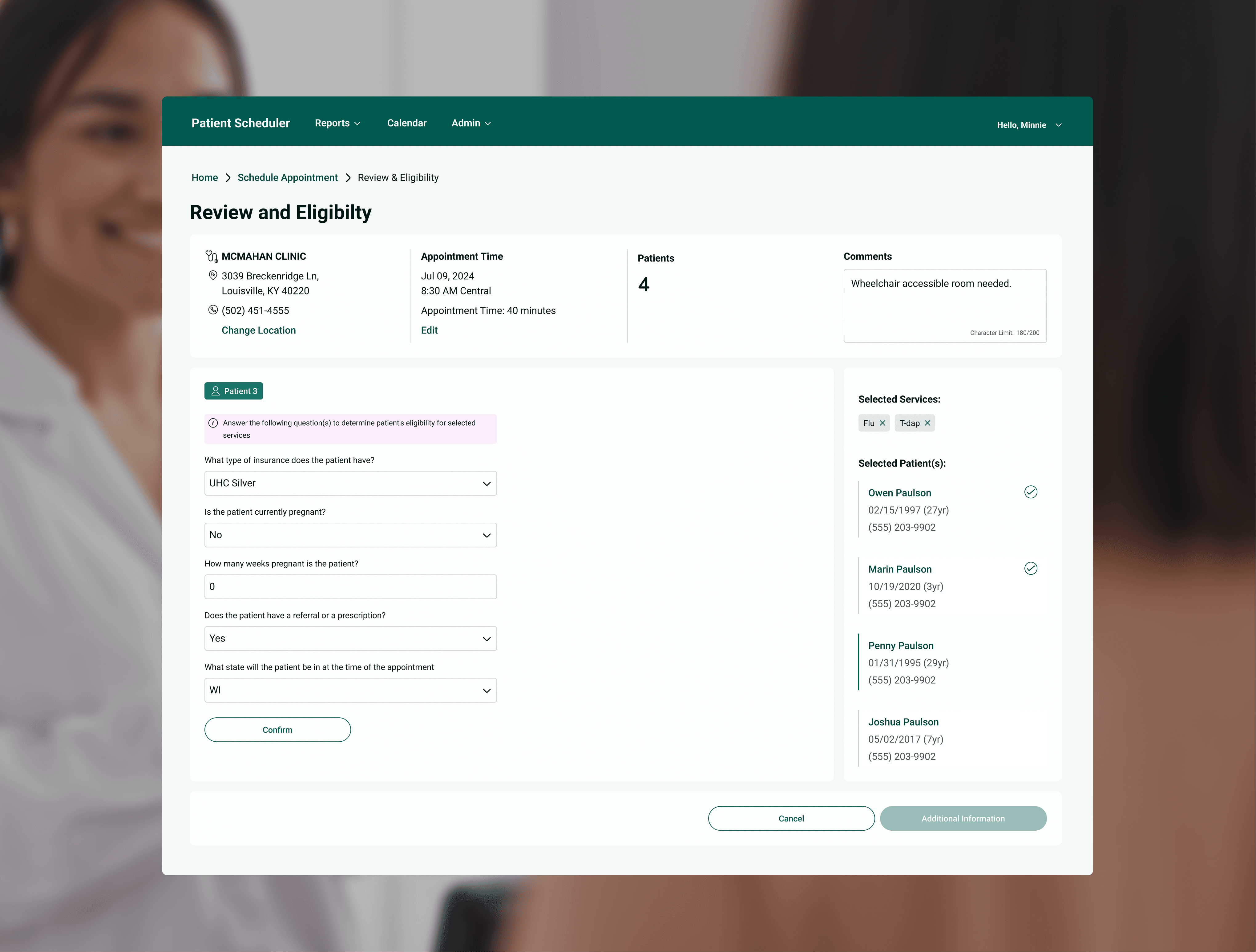
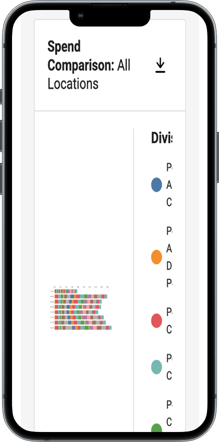
Spend Overview Dashboard — The Spend Overview Dashboard lets customers analyze their buying patterns. They can view these trends as tables, graphs, and charts, or download the raw data as CSV files.
Examples of the available information:
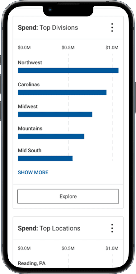
Top Divisions
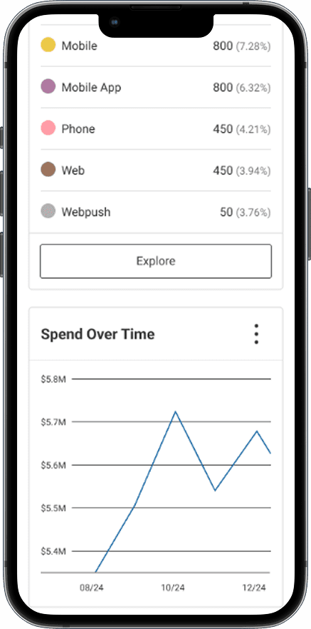
Spending Over Time
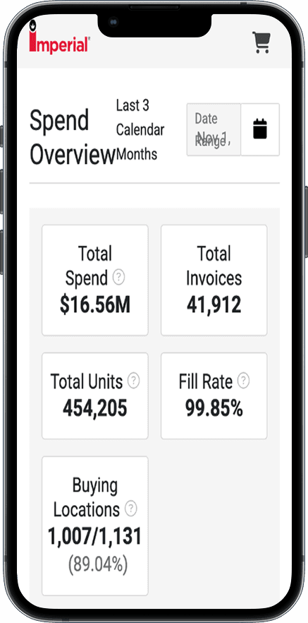
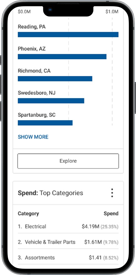
Location Spend Comparison
Users
Men: 45 - 54 / 25 - 34 / 35 - 44 years old
Mobile Devices: 1 in 4
Roles: Finance Managers / Business Owners

Problem
The Spend Overview Dashboard and its insights are only accessible on larger screens. The layout and data visuals do not display optimally on mobile browsers. This degrades the user experience and accessibility of important information, limiting customers' access to their data and disrupting their workflows.


Goal
Make the Spend Overview Dashboard responsive to small screens
Context:
The Spend Overview Dashboard is a customer-driven feature released in December 2024. It stemmed from a major customer’s request to analyze and understand buying patterns across their shops.
The initial solution was a Power BI dashboard. However, this was not sustainable in the long term, and the UX team saw value in extending this feature to all its customers. To ship the feature quickly, the team focused on releasing a desktop solution as the first iteration.
Business Value of a Mobile Dashboard
Empowers customers to make informed decisions from anywhere
Increases transparency, making it easy for clients and advisors to collaborate, reducing the time advisors spend retrieving data for clients, and streamlining both groups' workflows
Strengthens perception of Imperial Supplies through modern, accessible, and innovative technology, showing a commitment to customer satisfaction
Solution


Process
Disclaimer: Design is rarely a linear process. This outline closely mirrors my real-life timeline. However, it is organized relationally rather than chronologically. Research or discovery questions often come up while designing or after reviews.
Discovery
Objective:
Understand the purpose, function, and context of the Spend Overview Dashboard.
Process:
Interview the Spend Overview desktop designer
"Did this come from a business request or user feedback?"
A major customer requested a dashboard to analyze spending trends.
"Who is the primary user?"
Finance Managers
Business Owners
"What were the technical constraints and business requirements?"
The team moved quickly, iterating rapidly and prioritizing a desktop solution.
Outcome:
Gathered information about the conditions in which the dashboard was created, helping me avoid rework and make sure my design choices matched the business's goals
Research

Objective:
Identify common and effective dashboard design patterns.
“Sometimes time spent reinventing the wheel results in a revolutionary new rolling device. But sometimes it just amounts to spent reinventing the wheel.” Steve Krug
Process:
Review mobile dashboards across product types
Web and social media analytics
Financial app reporting
Fitness app metrics
Outcome:
Collected examples that sparked design ideas and supported my decisions

Hand-Off

Objective:
Deliver designs and requirements to developers.
Process:
Outline UI and functional requirements in Jira tickets
Prep Figma file for hand-off
Outcome:
Ensured the accurate implementation of the design's UI and functional requirements. Streamlined developer workflows for efficient development.
UI Design Highlights
Quick Sharing for Seamless Collaboration
The desktop version of the dashboard lets users easily download CSV files of their data. Considering the primary users and their jobs, I suggested adding a feature to share these files via email directly from the website. This would make it easier for users to communicate and collaborate with their stakeholders.
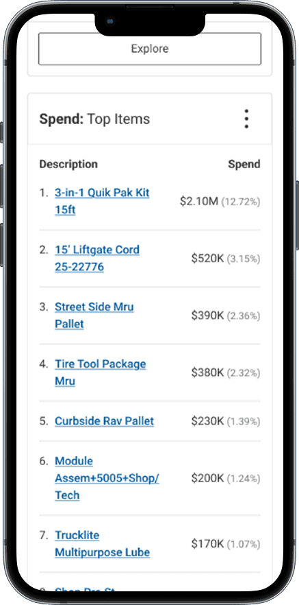
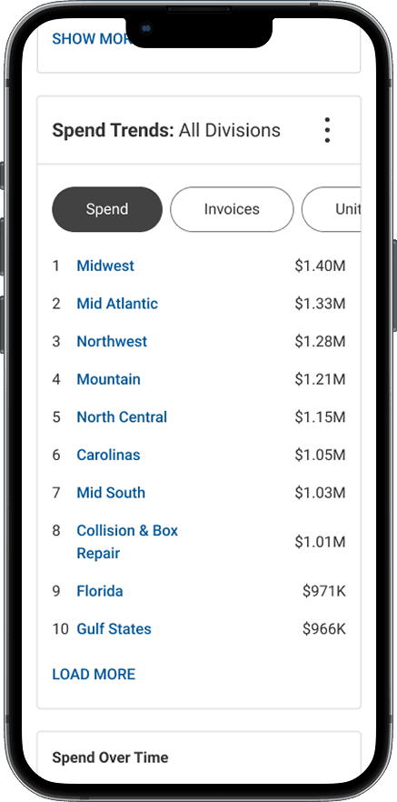
Mobile-Friendly Tables
Tables are essential to the Spend Overview Page experience. They provide important details that help in making good business decisions. However, creating tables that are relevant, clear, and easy to understand was one of the biggest challenges while designing the mobile version of the Spend Overview Dashboard experience.
I explored options such as truncation, pagination, horizontal scrolling, text links, and pill filters to make the tables easier to read and navigate. My final designs considered technical limitations, business requirements, user needs, and desk research.


Accessible Bar Graphs
When I designed the bar graph widgets, I focused on making them accessible while using the Imperial Supplies brand colors. I also experimented with less common interaction patterns and considered how much information to display without overwhelming users.

Impact
The mobile Spend Overview Dashboard is in development. We have not yet measured its impact on customers. However, the immediate business impact is making the Spend Overview Dashboard accessible on small devices. This will help customers make better decisions and support Imperial Supplies in transforming its technology.
Once the mobile view is live, we can track analytics such as the number of new and returning users, downloads, and customer journeys. This will help us assess its effectiveness and identify any issues. Over time, we will also collect customer feedback.
Feedback Objectives
Gauge the effectiveness of the mobile experience
Identify usability issues and pain points
Possible Questions
How would you rate your experience using the mobile Spend Overview Dashboard? [1—5 scale]
What is the reason for your rating? [Open-ended response]
Next Steps
Collect Customer Feedback
Status: Coming soon
Track Analytics
Status: Coming soon
Continuous Improvement
Status: Coming soon
Reflection
Challenge: How do I simplify data while still providing valuable insights?
To show valuable insights on small screens, I needed to understand the user and make educated assumptions about what they needed. Since I couldn't talk with users, I designed with the assumption that someone using their phone wanted quick summaries rather than in-depth details. Similar to other products that provide analytics, the desktop version of this product offers detailed data, while the mobile view serves as a handy tool for quick looks at information and sharing.
Highlight: Collaborating with developers
Open and collaborative relationships with my developers were key to the success of this project. I approached each conversation with curiosity and humility while using established UX principles to advocate for the best possible user experience within the technical limitations.